
Angular Material Tutorial - Part 2: Creating a Reusable Form Field Component
Create a Reusable Form Field Component using Angular Material

Two components remain to remove the bloat from the form field components. Assume the form fields consist of three elements, a label, the material input, and the validation message.
The components required to create the form field repeat, adding to the bloat. The goal remains to not repeat yourself. Covering 99% of the use cases and having a consistent form field that meets expectations of the user, wrapping the form field, label, and validation message directive from part 1 into a reusable component is the goal.


Goals
- Create a Reusable Material Form Field Component
- Create a Reusable Form
- Show the Slimmer Login Form Component
1. Create a Reusable Material Form Field Component
The component will consist of three input properties.
label - The label displays as the mat-label in the form field. It also serves as the fieldName for the validationDisplayDirective created in part 1.
control - The form field control of the material input
appearance - This controls the appearance form field per Angular Material's option of the mat-form-field .
Angular Material's form field has issues with content projection when material input is entered in the ng-content area. The property formFieldControl defines as a MaterialFormFiedlControl<any> so the control may be overridden.
The matFormField property grabs the Material Form Field. ngOnInit helps define the _control property of the matFormField, suppressing errors complaining of missing material inputs.
Content projection slots exist allowing form field prefixes and suffixes for icons. The mat-label component contains the label property. The ng-content projects the material component used in the containing form. Finally, mat-error contains a span field with the [appValidationDisplay] directive that watches the control for different validation error messages.
Below, notice the markup removed from the form making it easier to read.
Ah, that's nice. It's slimmer than it's predecessor bloating the mark up with validation messages and labels.
Now, if multiple forms need to support these CRUD type applications a consistent experience for the form should also be implemented.
2. Create a Reusable Form
The form exists for the purpose of saving the data and cancelling. The buttons should have a consistent style and emit different actions up to the consuming component. Again, no one wants to keep re-writing this markup and for behavior and style to differ between forms.
From the form component, the consuming component listens for events save and cancel. The consuming component handles these actions as the orchestrator knowing which services to call.
The consuming component's responsibility controls the data pushed into the form component including button disabling, button text, title, and saving.
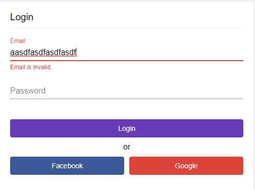
3. Show The Slimmer Login Component
Lets put the pieces together of the form, form fields, and validation messages. In this instance, lets create a User Login Form.
Two form fields with a couple of attributes per each field improves the readability of the markup. The form requires more attributes but provides a uniform user experince. Best yet, reusing the component for the multiple input use cases makes updates across multiple forms easy.
The loginFromGroup implements the email and password FormControls. They include any needed validations that the ValidationDisplayDirective shows when the control possesses a matching error key in the VALIDATION_MESSAGES map of validation key/error message.
Summary
Creating a consistent experience for developers and the end user should remain priority. The form field encompasses a lot of markup bloat including a label, suffix, prefix, and validation messages. These can be slimmed down in the FormFieldComponent which handles quite a bit of our use cases in Angular Material forms.